Improving wellbeing data access and literacy: New Understanding Society wellbeing data dashboard
As the UK’s largest longitudinal household survey, Understanding Society is an invaluable resource for anyone who wants to understand long-term trends in wellbeing outcomes across population groups.
To make the survey’s wellbeing data more readily available to non-academic users, we have collaborated with the Institute for Social and Economic Research at the University of Essex to launch a wellbeing data dashboard.
This project consolidates our long-standing effort to improve the use of national wellbeing statistics and increase engagement with data on how we are doing as individuals at national, regional, and local levels.
Here, Evidence Associate Margherita Musella introduces the new tool.
The Understanding Society Household Survey
Understanding Society has been following a large representative sample of people across the UK since 2009, providing a long-term perspective on people’s lives.
It tracks changes over time for a comprehensive range of social, economic and health circumstances, attitudes, behaviours, and outcomes.. This includes life satisfaction, physical and mental wellbeing, and social capital within and across individuals and families over time and place.
The survey’s longitudinal nature, large scale, and use of ethnic minority and immigrant boost samples allows for:
- analysis of wellbeing trends by small demographic subgroups, including specific ethnic minority groups
- investigation of wellbeing inequalities beyond income or health inequality
- analysis of wellbeing trends and inequalities by nations, regions and different levels of multiple deprivation
Responding to wellbeing data needs among non-academic audiences
A recent independent evaluation of the study showed that, while there is interest in its insights among decision-makers, charities, and companies, over 90% of data users are from UK higher education institutions.
UK Government analysts, charities and other organisations were found to make up only 7% of survey users, a trend which may be explained by the complex design of Understanding Society data:
“When policy makers require quick research answers, the complexity of Understanding Society can mean that some organisations do not have the required capacity and time to invest in the data, and other datasets may be used more readily”. 1Harding, S., Tazyman, S., Higton, J., Roberts, J., & Rice, N. Evaluation of Understanding Society: Impact and views of data users. Report by CFE Research for ESRC. May 2022. p. 42
There is a clear need to increase the availability of accurate and timely data on wellbeing trends over time for several specific audiences for the purposes of exploratory analysis, evaluation and decision-making.
For charities and their evaluators, there are common methodological pitfalls regarding the use of population-level wellbeing data in pre-post evaluations. Our previous reviews of the evidence on Subjective wellbeing and Mental wellbeing interventions reflect:
- the relatively poor access to updated national and local wellbeing data releases, and data for specific groups;
- a general lack of knowledge of how to select suitable statistics to use as comparators within select evaluation designs.
For policy officials, there is increased demand for data on wellbeing trends since the publication of the Green Book Supplementary Guidance on Wellbeing. While the guidance means data and measures can now be used more easily to set priorities for public spending in the research, policy long-listing, and short-listing phases of the policy cycle, descriptive statistics for key wellbeing variables continue to be less readily available compared to metrics used in economic debates, such as GDP.
Building a wellbeing data dashboard
In early 2022, following Understanding Society’s publication of the COVID-19 dashboard, What Works Wellbeing and the University of Essex began to explore the potential for developing a wellbeing data dashboard to support data access and literacy among certain target audiences.
Using its knowledge of the evidence on key wellbeing drivers and determinants, the Centre commissioned an independent researcher to build the data structure for dashboard using data from 15 wellbeing variables, spanning three domains:
1. Social Capital and Social connection
- Neighbourhood belonging
- Loneliness
- Sense of civic duty
- Interest in politics
- Having a say in what government does
- How qualified they feel to participate in politics
2. Physical and Mental Health
- General Health Questionnaire (GHQ-12) (Psychological distress)
- General Health (SF12)
- SF-12 (Physical and mental health domains)
- Short Warwick-Edinburgh Mental Wellbeing (SWEMWBS) measure
3. Evaluative wellbeing and Life domain satisfactions
- Life Satisfaction (Evaluative wellbeing)
- Satisfaction with health
- Satisfaction with income
- Satisfaction with leisure time
- Happiness with relationship
Similarly to the Covid-19 dashboard and the more recent material deprivation dashboard, the wellbeing variables were plotted against data on seven socio-demographic characteristics:
- Age
- Sex
- Ethnicity
- UK Country
- Marital status
- Urban/rural setting
- Carer status
Where available, the data covered the survey’s Wave 1 (2009/2010) to Wave 13 (2021/2022).
Using the dashboard – functions and features
The dashboard offers easy access to the core and commonly used wellbeing measures in Understanding Society including life satisfaction, loneliness, health and community.
Users can select a variable of interest and up to two socio-demographic characteristics on the dashboard landing page.
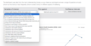
Clicking the ‘Submit’ button generates a downloadable graph which presents mean or percentage data for the variables of choice.
For example, Life Satisfaction percentage scores for Waves 1-13 plotted against UK country (Figure 1).
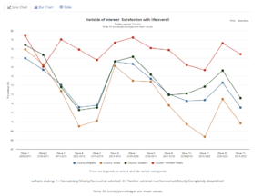
Figure 1 Satisfaction with life overall, plotted against UK country (Waves 1-13)
In Figure 2, we can see General Health percentage scores plotted against ethnicity.
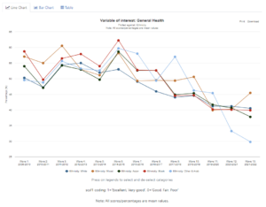
Figure 2 General Health, plotted against Ethnicity (Waves 1-13)
Next Steps
As a broader range of users begins to take advantage of Understanding Society’s rich wellbeing dataset, the survey can continue to contribute to the broader wellbeing evidence base, and support policy directions and priorities to improve and sustain quality of life in the UK.
For charities and their evaluators using the data, the increased accuracy of impact estimates can provide a clearer picture of the wellbeing outcomes and impacts of social interventions.
Understanding Society welcomes feedback from dashboard users on the application of wellbeing statistics and suggestions for improvements to the dashboard.
If you would like to give feedback, please get in touch with the Understanding Society User Support team by emailing usersupport@understandingsociety.ac.uk.
Blog
![]()
[gravityform id=1 title=true description=true ajax=true tabindex=49]